The Experience Music Project

The Masticator in Seattle continues with a tour of the Experience Music Project
I'll confess I went into the Experience Music Project with a bad attitude. I'm not a big fan of Frank Gehry's architecture, and all I could think about as I walked in was a pharmaceutical commercial in which a polished baby boomer in Dockers takes his son on an arm-pulling tour of the place.Is it a museum or a theme park? Ah, it's neither; it's a "project." Paul Allen, the cofounder of Microsoft and the (self-proclaimed) owner of the world's largest collection of Jimi Hendrix memorabilia commissioned architect Frank Gehry to design this "project" in the 90s. His sister Jody Patton runs the place.
Don't get the EMP (as they call it) confused (as I did) with ELP. That's Emerson Lake and Palmer. They're different.
The EMP is on a corner of the Seattle Center at the terminus of the monorail next to the Space Needle.
I think I would have had a very different "experience" of the EMP if I hadn't had to shell out $19.95 to get in. To be honest, I only paid the price of admission because I was under the impression that the high fee included admission to the exhibit called "Double Take: From Monet to Lichtenstein", an art exhibit that takes improbable pairings of art masterpieces and shows them side by side. It sounded ambitious. When I journeyed up the stairs of the cavernous project interior to the second floor, I was turned away from "Double Take" because I didn't have the correct pass: it was another $5. (looking at the website, it seems as though I could have paid a mere $8 to see only the "Double Take" exhibit. That certainly wasn't clear when I was there.) I was enraged.
I refused to pay any more to see what I had come to see, but I was determined to get my $19.95 worth out of the "project."
How do you make a museum about music? And how do you make it interactive? The "experience" part of the project is easy. There are recording booths with simplified drum sets, keyboards, and guitars for visitors to use, and that may be the most exciting part of the place.
But the project's exhibits, separate from the temporary "Double Take" show, can be summed up in one word: guitars. That's it. There's a multi-story column of guitars. There are guitars from many rock musicians. Guitars.
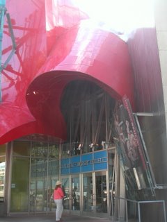
On the positive side, Gehry's building, part of which is the Science Fiction Museum and Hall of Fame ($12.95 admission or $26.95 for the SFM and the EMP both) is not like the Gehry building I'm most familiar with. Unlike Minneapolis's Wesiman Art Museum, the inside of the EMP relates to the outside's undulating shape. The interior spaces are shaped exactly like the outside structure.
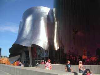
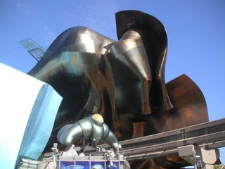
 One of the reasons I'm not a fan of Gehry's work is not that he's a one trick pony (although he is); it's that I don't like that one trick. Some architects have signature styles, motifs or forms that always pop up in their work. For Santiago Calatrava the forms are arcs and fans inspired by his engineering background. I like that trick. Gehry's forms are crumpled tin foil. I don't like that one.
 But unlike the Weisman, where the crumpled tin foil is merely an exterior cladding bolted to a brick box, the EMP's exterior is structural. Unfortunately, it's awfully dark inside. Maybe the dimness is part of Paul Allen's rock and roll vision. I say the interior needs more light -- either natural or some very creative artificial light.
 On the positive side again, it's challenging to walk around the building and try to wrap your mind around its shape. Even harder to snap a representative photo of it. The most inviting side, and the one facing the Space Needle (which is about 500 feet away), is the entrance to the Science Fiction Museum. That's too bad. I think it takes away from the rock and roll part to have the grandest entrance for the least known tenant.
 The Interior
The third floor has a really nice concert poster exhibit, one based on the 2004 coffee table book Art of Modern Rock: The Poster Explosion. But as I walked through the exhibit, I was still disappointed. I realized why:1. I was still bitter about spending $20 to get into a museum about nothing.
2. No matter how interesting the exhibits are, the building always distracts you from its contents. The structure competes with the stuff inside and it always wins.
But that's what you do when you have lots of money and lots of will to realize an empty idea or a lackluster collection. Ask the Getty in Los Angeles. They took a galactic-sized endowment and a mediocre collection and came up with a remarkable building (designed by Richard Meier). And it's free.
Another thing you can do if you don't have a good collection is borrow from other museums. Or even -- as the EMP does with "Double Take" -- exhibit something far outside your jurisdiction.
The interior doesn't deal well with its exposed guts. The post-industrial style we're used to these days -- exposed air ducts and all of the other stuff that's visible when the acoustical panel dropped ceilings are removed -- does not translate well to this structure. At its best, the post-industrial interior style lays bare a building's inner workings. It shows us function without adornment.
Since the EMP is all form -- the wacky curves the antithesis of function -- exposing the ducts, using stage lights on suspended bars, and showing the insulation clad twisted I-beams makes the building actually look unfinished.
Baby Boomer Self Indulgence
This museum is the sort of overblown monument to one man's whims that can only happen -- and subsist -- in a good economy. A baby boomer economy so enamored of its own reflection that it can pay $19.95 for a museum without a concept housed in a building that looks like it was inspired by the crumpled up blueprint for a better idea.Another way to sum up the museum -- oops, it was a project, right? -- is with its On Stage section where you can "Be a rock star - even if you've never played an instrument!" It's a rock star simulation that "transports you to the center stage of a large arena, complete with smoke, hot lights and screaming fans." You can buy a souvenir DVD of your performance.
This, like the project and the building that houses it, is much ado about nothing, or, an embarrassing celebration of the uniquely American notion of individuality. Who do we think we are? Stars, each and every one. But the problem is -- forgive my latent judgmental Norwegian bachelor farmer side -- we're not all superstars. We're schlubs from rural Idaho. We're middle managers from the heartland, here on junket. We're accountants trying to show our wide-bottomed dates that we have a wild side. We're not special.
In America, money can buy you a lot. But it's no substitute for good ideas. If a billionaire wants to make a giant tin foil tent to house some guitars he bought off the estate of a dead rock star, and then overcharge tourists for the privilege of experiencing it, he can.
To enjoy this project you have to buy into the idea that we are all stars. That the baby boom generation's self absorption and conspicuous consumption are worth celebrating.
The Biggest failure of All: The Gift Shop
If you do buy into the concept of the EMP, the biggest failure for you will be the project's inability to sell you stuff. Surely a museum about experiencing music ought help you experience (or hear) music long after your visit is over. It should be the region's biggest retailer of CDs, concert DVDs, posters, and rock star biographies. Maybe even some musical instruments.The EMP's gift shop was light and airy with a lack of meaningful merchandise. Very few CDs. Very few posters. Plenty of personalized EMP coffee mugs. A sorry selection of sunglasses made me think of how great it would be if the gift shop sold replicas of rock star shades. They could be selling Elvis glasses, Elton John glasses, John Lennon glasses, etc.
What I'm saying is that if you fail as a museum, you can at least succeed as a retail shop. The EMP misses a huge opportunity here.
Conclusion
I understand that I'm not the target audience for this project. I'm a museum person and this isn't a museum. It's a project, something closer to a Disney imagineering of rock and roll history. It's for the guy in the drug commercial I mentioned in the beginning of this review: a regular family man with disposable income who wants to tell his children about his music. The project seems designed to do just that.But I'm not out of line criticizing a building doesn't relate to its contents (in spite of Gehry's statements about the museum being inspired by smashed guitars), that in fact overpowers its meager contents and fails to adjust its interior spaces to the shapes and problems its radical exterior creates.
As a solution to this building, an antidote if you will, I would pose Rem Koolhaas's amazing Seattle Public Library, a building that takes its contents and its purpose into account to create a stunning space, inside and out. It's as radical a design as Gehry's, but it's much friendlier to look at outside and to be in, inside. More on that later.


0 Comments:
Post a Comment
<< Home