Rem Koolhaas's Seattle Public Library
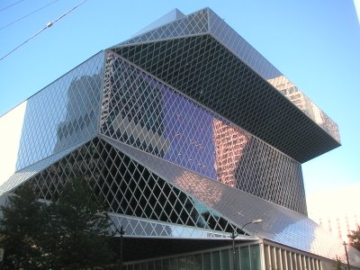
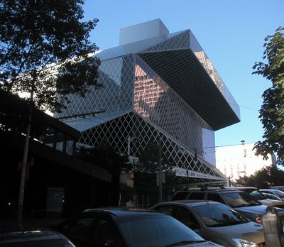 As I mentioned in previous posts, I'm in Seattle for a few days on business. I've been walking all over the city looking at stuff, including some interesting buildings. I have some unkind words for Microsoft founder Paul Allen's Experience Music Project, a strange lump of a museum designed by Frank Gehry -- just scroll down. But I was impressed with Dutch architect Rem Koolhaas's Seattle Central Library. It's everything Gehry's EMP isn't.
 Here, from the New York Times Magazine, is why:
"Koolhaas, despite his professed admiration for Gehry, is uncomfortable with buildings that, like the Guggenheim Bilbao, seduce by dazzling. He wants to arrive at beauty as a byproduct, not the goal, of the design process. He is suspicious of the wow factor. "I like to do things that on first sight have a degree of simplicity but show their complexity in the way they are used or at second glance," he says. Although he is not a pop-culture celebrity on the order of Gehry, within his profession Koolhaas is the more influential figure -- because he writes as provocatively as he designs and because his innovative style, unlike Gehry's metallic whorls, has not solidified into a one-of-a-kind signature. "We are flamboyant conceptually, but not formally," Koolhaas says. His firm is known for thoroughly researching and radically addressing a client's needs; this cerebral approach to design undergirds all of his work."
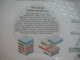 Where Gehry is abstract and instinctual, Koolhaas's architecture is the result of theories made practical. Nothing in a Koolhaas building is accidental or capricious, even when the shapes are as playful as they are in the Seattle Library.
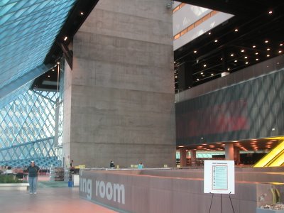
  Where Gehry's EMP building had unfinished ceilings, Koolhaas is self-conscious about what's finished and what isn't. In one part of the building, angled support beams are covered in sheetrock and neatly painted up to a certain height. The rest of the beam is exposed to its fire-proof insulation.
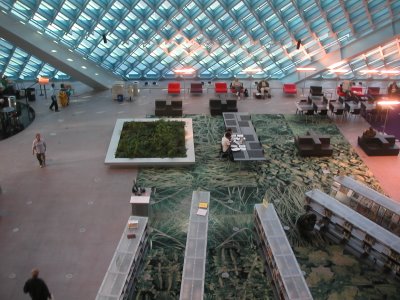
 The views from the balconies in the ten story building are stunning. The angles created by the glass and steel diamond-pattern planes of the exterior walls intersecting are mesmerizing.
As I was standing outside the Elliot Bay Bookstore (why doesn't Minnespolis and St. Paul have a big bookstore this good?) getting ready to walk to the library, a cab driver saw me looking at my map and asked if I needed help finding anything. When I told him I was headed to the library, he told me where it was, the history of Seattle's five main libraries and how some of them burned down, that fact that the new one was earthquake-proof and some $20 million over budget, and that the one-mile trip there was a very nice cab ride. I declined the taxi, but we had a nice chat about libraries.
I don't know how this building will age, but it's much more dazzling than Gehry's EMP inside. And as Koolhaas had hoped, it stands up to scrutiny. The more you look, the more there is to see and be dazzled by. Gehry's building is an abstract artistic meditation on music and guitars. It's very personal, and I don't see it as completely realized. It strikes me as unfinished in both a theoretical and literal sense. Koolhaas's Seattle Public Library is a thoughtful and functional building that is also very beautiful. It's the succesful marriage of architectural theory and engineering.


0 Comments:
Post a Comment
<< Home