Replacing Good Design With Bad
 Good graphic design in consumer goods isn't always easy to come by. When I see something well-packaged, a shallow part of me wants to own it just so I can look at it. Warhol couldn't have done what he did with a soup can if Campbell's hadn't come up with such a well-constructed label. There are lots of mundane products with very satisfying labels out there, and sometimes, the labels add to the product's cachet. A good example of this was (notice I say was) the label of a brand of Brazilian Cachaça, shown at left. Cachaça is a sugar cane liquor similar to rum and tequila. It's trendy right now for the Caipirinha, a mixture of cachaça with lime and sugar.
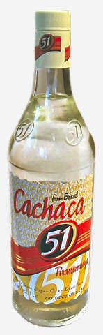
 This isn't the only brand of cachaça, but it's one of the most common. I think the name of it is PIRASSUNUNGA 51. The label is beautiful. It invokes a fifties glamor, maybe even a pre-Castro Cuban style aesthetic. There are layers to the design, and the script is fabulous. The colors are satisfying together. The biege-ish color is surprising when offset by the yellow, black, gold, and red. But something happened:
 Maybe someone decided that they'd had that label for forty or fifty years and it was time for a new one. I respect that, but do it right. This isn't an update, this is a desecration. The biggest problem with this new label, the single thing that ruins it, is the typeface for the word "Cachaça." It's completely wrong in style, in size, and in thickness. It doesn't match anything else on the label. This was a mistake for the company, one a shallow, design-motivated hipster like me may respond to by moving to a more satisfying label. I present PITU:
 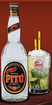 Isn't the lobster motif wonderful?
  Here's another example. I bought a DVD of one of my favorite horror comedies recently -- Ken Russell's 1988 classic The Lair of the White Worm. It's a strange tale starring Hugh Grant, in which an ancient cult based on a giant prehistoric worm-like thing causes mayhem in a small English town. Amanda Donohoe is excellent as the freaky worm-worshipper Lady Sylvia Marsh. The original movie poster and subsequent VHS box had a great design. That's Donohoe coming out of a basket, snake charmer style. The arabesque swirly background is perfect for it -- it says exotic camp, which is just what the movie is. But now look at what they've done. I don't need to show you a large picture of the new cover because there's not much to see. Just a huge blue Hugh Grant, dominating the once enchanting design.
  Donohoe is now on the margin and the eye-popping background is gone. Grant sells movies, so they blew him up. Better, they must have thought (that elusive "they" -- who are they?), to trick young fans of Grant into buying a creepy kitschy Ken Russell movie than to leave the cover as it was and attract viewers who might like the movie.
 The lesson is this: don't change something because it's old. Change it for other reasons. And when you do, do it right. Think about it. Good design will endure, whether you want it to or not.
posted by The Masticator at 9/30/2006 03:00:00 PM
![]()
![]()


0 Comments:
Post a Comment
<< Home