posted by The Masticator at 9/30/2006 03:06:00 PM
0 comments
![]()
![]()
The Masticator was started by two Minneapolis-area visionaries as a zine in the summer of 2004. Issue two was never realized, and half of its founding force moved to Brooklyn. Three years later, the electronic version of The Masticator has far eclipsed its single print-bound predecessor. Today, The Masticator posts art reviews, random urban snapshots, gentle political mockery, and other short articles on subjects like cars, fashion, and books.
 Good graphic design in consumer goods isn't always easy to come by. When I see something well-packaged, a shallow part of me wants to own it just so I can look at it. Warhol couldn't have done what he did with a soup can if Campbell's hadn't come up with such a well-constructed label. There are lots of mundane products with very satisfying labels out there, and sometimes, the labels add to the product's cachet. A good example of this was (notice I say was) the label of a brand of Brazilian Cachaça, shown at left. Cachaça is a sugar cane liquor similar to rum and tequila. It's trendy right now for the Caipirinha, a mixture of cachaça with lime and sugar.
  Maybe someone decided that they'd had that label for forty or fifty years and it was time for a new one. I respect that, but do it right. This isn't an update, this is a desecration. The biggest problem with this new label, the single thing that ruins it, is the typeface for the word "Cachaça." It's completely wrong in style, in size, and in thickness. It doesn't match anything else on the label. This was a mistake for the company, one a shallow, design-motivated hipster like me may respond to by moving to a more satisfying label. I present PITU:
  Isn't the lobster motif wonderful?
  Here's another example. I bought a DVD of one of my favorite horror comedies recently -- Ken Russell's 1988 classic The Lair of the White Worm. It's a strange tale starring Hugh Grant, in which an ancient cult based on a giant prehistoric worm-like thing causes mayhem in a small English town. Amanda Donohoe is excellent as the freaky worm-worshipper Lady Sylvia Marsh. The original movie poster and subsequent VHS box had a great design. That's Donohoe coming out of a basket, snake charmer style. The arabesque swirly background is perfect for it -- it says exotic camp, which is just what the movie is. But now look at what they've done. I don't need to show you a large picture of the new cover because there's not much to see. Just a huge blue Hugh Grant, dominating the once enchanting design.
  Donohoe is now on the margin and the eye-popping background is gone. Grant sells movies, so they blew him up. Better, they must have thought (that elusive "they" -- who are they?), to trick young fans of Grant into buying a creepy kitschy Ken Russell movie than to leave the cover as it was and attract viewers who might like the movie.
posted by The Masticator at 9/30/2006 03:00:00 PM
0 comments
![]()
![]()
Three of the crews brought in whales. This is considered spectacular for the first day. They bring them to the beach to be butchered. They are all ready done as I write. That was a lot of work. I saw loads of fresh cut whale meat zooming down the street in trailers and being hauled by ATV's. It looks remarkably like huge slices of watermelon.That may be enough to get me off cute. But just to make sure, I'll check out the post where he meets a Filipino guy who tells him about eating dogs and cock fighting. I'll let you find that post on your own. It's been fun to read about Mike's adjustment to the North. He posts some good pictures, too.
Angus MacDougall is a three-year-old terrier mix that has recently been blessed with the revered and holy image of Jesus Christ on his hindquarters. Is this manifestation of The Prince of Peace a coincidence or a bona fide miracle?I suggest you push the "click here for a miracle" button.
posted by The Masticator at 9/30/2006 02:29:00 PM
0 comments
![]()
![]()
 I went to beautiful, conservative Staten Island with a friend a couple weeks ago. The ferry was fun, and the crowds were big. The Staten Island minor league Yankees were playing a game at the stadium on the shore overlooking Manhattan. It looks like a great place to watch a game. Didn't stay for it though. But now I can say I've been to all the five boroughs.
posted by The Masticator at 9/30/2006 02:25:00 PM
0 comments
![]()
![]()
posted by The Masticator at 9/30/2006 02:20:00 PM
0 comments
![]()
![]()
 I’m reading another spy novel by former deep cover CIA agent Charles McCarry (see earlier blog on Old Boys) – it’s actually his first one: The Miernik Dossier, published first in 1973. It takes place in about 1959, and , roughly, it’s about a group of Geneva, Switzerland-based spies of American, British, French, and Polish nationalities, along with a six feet, eight inch-tall Sudanese Muslim prince named Kalash el Khatar, a character who appears in McCarry’s most recent book, Old Boys, set more than 40 years later.
 Miernik’s chair went over backwards. He was standing and speaking to the Germans. He held a table knife in his hand. The Germans stood their ground, either astonished by this display of bad manners or unfrightened by a one-armed man [Miernik wore a cast] with a dull knife. One of the German women carried a Pekingese in her arm; throughout the meal and the violin concert she had been feeding it and talking to it.Upon which the Germans leave, the dog lady sobbing, and Miernik pours more wine for his friends. It’s the strangest scene. The irony is completely lost on the Germans.
“One moment,” Miernik said. “I want to kill your dog.” The woman shrieked, and a lok of real horror came into her eyes. Her husband stepped between the dog and Miernik. “You are drunk,” he said.
“Quite sober,” Miernik said. “Hand over the dog. We have been watching you and we have our orders. The dog must die.”
The German turned on his heel and began to herd his friends toward the door. “Halt!” Miernik shouted. “Come back or I shoot.” The Germans stopped and turned around again—all except the woman with the dog. She now had both arms around the animal. She stared at Miernik over her hunched shoulder. “You are insane,” she cried.
“How long have you been hiding this dog?” Miernik asked in the loud German he was speaking. “Speak up—and remember there are witnesses present.”
“Who are you,” asked the German. “You are not a German.”
“My name does not matter. It is enough that you know that I am an officer in the Dog Death Brigade. You have forgotten that dogs are not human beings. They are dogs. Dogs. Dogs who are shitting on our sacred soil, taking food from the mouths of good human children.”
The violinist looked from Miernik to the Germans, and his giggle changed to a spasmodic, snorting laugh. He had heard this sort of talk somewhere else. With his hand over his mouth, he scuttled away, the thousand-lira note [a tip from the Germans] fluttering to the floor behind him.
“If you did not have that arm in a sling,” the German said, “I would slap your face for you.”
“I don’t doubt it for a moment,” Miernik said. “Your late leader, Reichsführer Himmler, would do practically anything to protect a dog. He may be dead, but the kingdom of his ideas lives on. Take your dog and go. But remember: one day soon the gutters will run red with the blood of dogs.”
posted by The Masticator at 9/29/2006 09:05:00 AM
0 comments
![]()
![]()
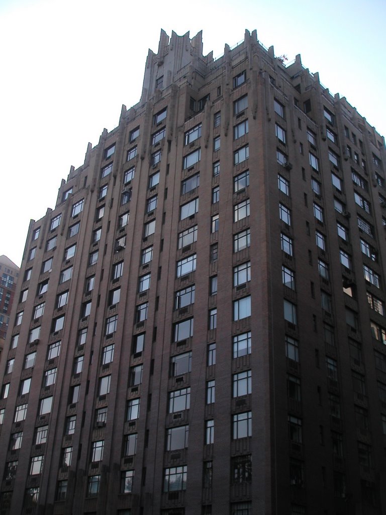 A friend told me she was sure the apartment building in the classic 1984 film Ghostbusters wasn't a real place. It is. It was made to look much larger in the movie, and certain Gate Keeper / Key Master-shaped gargoyles were added, but the building is real. It's at 55 Central Park West across the street from Central Park's Tavern on the Green (where Rick Moranis runs to and smears his hands on the windows before becoming possessed by the hellhound).
posted by The Masticator at 9/26/2006 11:42:00 PM
1 comments
![]()
![]()
 I found myself at an Irish bar in Hell's Kitchen last Saturday night, surrounded by crazed Nebraskans. I learned they gather there to watch football, University of Nebraska Cornhuskers football. New York truly has everything. The bar -- the "Irish Rogue" -- hosts these Nebraska Society of New York events frequently. I tried to find such a group for the University of Minnesota once. There was such a thing, but the website (which isn't nearly as slick as Nebraska's) hasn't been updated in three years. The link to the bar U of M sports fans appraently watched games was a dead end. How is it Nebraska's so organized and we're not?
posted by The Masticator at 9/26/2006 11:29:00 PM
1 comments
![]()
![]()
As Robert Sullivan noted in his 2004 book, "Rats," a naturalist named David E. Davis analyzed New York's rat population in 1949 and called the one-rat-per-human statistic absurd. (The statistic had come from 19th-century England and was never more than a guess.)But with all the garbage in New York, isn't there an endless supply of food?
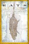 I haven't read Sullivan's book, but a statistic commonly quoted from it says that "Male and female rats may have sex twenty times a day. A female can produce up to twelve litters of twenty rats a year: one pair of rats has the potential for 15,000 descendants in a year." And they don't outnumber us? His book's full title is Rats: Observations on the History and Habitat of the City's Most Unwanted Inhabitants. In an
 "We think rats are disgusting, but they're not. They're just another creature. It's not their fault they live in our garbage. In fact, our garbage is our fault, if there's any fault. The reason people are so disgusted by rats is that rats point to what is disgusting about us. We always have to have something bad in our sights to highlight our goodness. You need evil so that good can exist. Really, in nature, it can seem evil, but it's not."
"Paxil and Oscar do their hunting late at night, during their last walks of the day. They began their crusade a couple of years ago, when they met in Riverside Park and prey was abundant. Paxil is an expert at flushing rats out of their hiding places. When she does, if they're small enough, she'll grab one and shake it until its neck snaps."And:
"In the two years they've been hunting, Paxil has dispatched nine rats, and mice beyond counting. Oscar's tally is 22. Not an enormous number altogether, but for them I don't think it's as much about exterminating as about hunting. Both have the instinct built into their breeds, and merely follow the urge to do the work expected of them."Wow.
posted by The Masticator at 9/26/2006 11:15:00 PM
0 comments
![]()
![]()
posted by The Masticator at 9/24/2006 06:21:00 PM
1 comments
![]()
![]()
 Bombay-born, London-based artist Anish Kapoor, most famous in America for his giant Chicago sculpture "Cloud Gate" in Millenium Park, has unveiled his "Sky Mirror" sculpture in New York -- but only for a short time. The
 Last year, not long after he was chosen to create a work by Tishman Speyer Properties, a co-owner of Rockefeller Center, and the nonprofit Public Art Fund, which helps to organize projects at the center, Mr. Kapoor came to New York to take a good hard look at the area. He was, he says, briefly at a loss.
"It's a very difficult space," he said. "I mean, there are already so many things there that one wonders: Do I really need to put anything else? What's the point?‚"
 He thought of making a misted-water rainbow installation or a column of smoke, but then he settled on duplicating one of his previous sculptures: The Nottingham Playhouse "Sky Mirror", unveiled in early 2001.
  So the Rockefeller Center "Sky Mirror" will be installed till late October. But where will it go next?
 Labels: art
posted by The Masticator at 9/20/2006 11:56:00 PM
0 comments
![]()
![]()
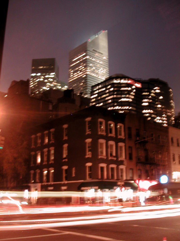 Last night whilst walking around with a friend in the Upper East Side, I swear we passed New York Times columnist Thomas Friedman. He's from Minnesota, you know. My friend and I had a couple drinks at Smörgås Chef, a favorite Scandinavian cafe of mine (with three locations!). We sat and watched as cops, often three per corner or more, halted traffic for diplomatic motorcades from this week's big U.N. meeting -- the one that the president is at. I took this picture of the street with the Citicorp Building in the background when we left.
posted by The Masticator at 9/20/2006 11:39:00 PM
0 comments
![]()
![]()
Speaking of the trend toward dramatically shaped buildings, Koolhaas observed that cities are "stuck with a series of buildings that are supposed to be exceptional, but the way they perform is inferior to their effect." Whether it's the extravagance of the "Bilbao effect," said Koolhaas -- referring to the undulating surface of Frank Gehry's Guggenheim Museum in Bilbao, Spain -- or the "sobriety" of the newly expanded Museum of Modern Art in New York City, he said, "the public receives both with equanimity."The Bilbao museum is wrought of the same crumpled foil that Seattle's EMP is.
"The most pernicious part of the Bilbao effect is that even major cities lose confidence and think they need extravagant buildings to remain interesting," Koolhaas said. He warned of the danger of architecture becoming "sloppy, uncritical. It's received with an enormous amount of attention and a negligible amount of seriousness."Judging by the shit I've seen built in New York, Minneapolis, Seattle, Boston, and a few other cities lately, I don't think anyone's really been thinking they have to build extravagant structures. If only we had such a problem! Still, he has a point.
posted by The Masticator at 9/20/2006 11:30:00 PM
0 comments
![]()
![]()
"Retribution as a moral principle is incompatible with a scientific view of human behaviour. As scientists, we believe that human brains, though they may not work in the same way as man-made computers, are as surely governed by the laws of physics. When a computer malfunctions, we do not punish it. We track down the problem and fix it, usually by replacing a damaged component, either in hardware or software."That's from Dawkins' answer to the Edge Foundation's annual question for public intellectuals from 2006: "What Is Your Dangerous Idea?" Dawkins continues:
"Why do we vent such visceral hatred on child murderers, or on thuggish vandals, when we should simply regard them as faulty units that need fixing or replacing? Presumably because mental constructs like blame and responsibility, indeed evil and good, are built into our brains by millennia of Darwinian evolution.His dangerous idea is that we'll "grow out of all this."
"Although I borrow Snow's phrase, it does not describe the third culture he predicted. Literary intellectuals are not communicating with scientists. Scientists are communicating directly with the general public. Traditional intellectual media played a vertical game: journalists wrote up and professors wrote down. Today, third- culture thinkers tend to avoid the middleman and endeavor to express their deepest thoughts in a manner accessible to the intelligent reading public."Ironically, Brockman seems to backstep from Snow's idea of literary intellectuals and scientists communicating in exchange for a shift where the scientists are the new public intellectual. These are, according to the Foundation, "physicists, evolutionary biologists, philosophers, biologists, computer scientists, psychologists, social, behavioral, and anthropological scientists, and science journalists."
"I suggest a different, even darker solution to Fermi'sAliens aren't exploring space because they're addicted to entertaining themselves.
Paradox. Basically, I think the aliens don't blow themselves up; they just get addicted to computer games. They forget to send radio signals or colonize space because they're too busy with runaway consumerism and virtual-reality narcissism. They don't need Sentinels to enslave them in a Matrix; they do it to themselves, just as we are doing today."
"Those who persist will evolve more self-control, conscientiousness, and pragmatism. They will evolve a horror of virtual entertainment, psychoactive drugs, and contraception. They will stress the values of hard work, delayed gratification, child-rearing, and environmental stewardship.Now that is a dangerous idea.
...
"Christian and Muslim fundamentalists, and anti-consumerism activists, already understand exactly what the Great Temptation is, and how to avoid it. They insulate themselves from our Creative-Class dream-worlds and our EverQuest economics. They wait patiently for our fitness-faking narcissism to go extinct. Those practical-minded breeders will inherit the earth, as like-minded aliens may have inherited a few other planets."
posted by The Masticator at 9/20/2006 10:31:00 PM
0 comments
![]()
![]()
Thank you for pointing out the error in our last email--you are correct that the subject line should have read "you're," not "your." The volunteer who re-typed the subject line before the email was sent made an inadvertent error. The person has been volunteering such long hours in the closing days of this tight race that it has led to a lack of sleep and bleary eyes! Lori prides herself on taking care with the English language, and we appreciate that you took the time to point out the error to us.There's a lesson here: Edit yourself and then have at least one other person edit your writing.
Thanks again. We hope to earn your vote.
The preface, by Truss, includes a misplaced apostrophe (“printers’ marks”) and two misused semicolons: one that separates unpunctuated items in a list and one that sets off a dependent clause. About half the semicolons in the rest of the book are either unnecessary or ungrammatical, and the comma is deployed as the mood strikes. Sometimes, phrases such as “of course” are set off by commas; sometimes, they are not. Doubtful, distracting, and unwarranted commas turn up in front of restrictive phrases (“Naturally we become timid about making our insights known, in such inhospitable conditions”), before correlative conjunctions (“Either this will ring bells for you, or it won’t”), and in prepositional phrases (“including biblical names, and any foreign name with an unpronounced final ‘s’ ”). Where you most expect punctuation, it may not show up at all: “You have to give initial capitals to the words Biro and Hoover otherwise you automatically get tedious letters from solicitors.”Some of Truss's goofs could have been prevented with simple fact-checking:
And it is stated that The New Yorker, “that famously punctilious periodical,” renders “the nineteen-eighties” as the “1980’s,” which it does not. The New Yorker renders “the nineteen-eighties” as “the nineteen-eighties.”Oh, it's hard being punctilious. Better not to say you are. Is that the cheap way out? Maybe. Bloggers have it easy. The medium is like the Wild West (should "wild" be capitalized there? Suddenly, I'm nervous) -- no need for editors, speelcheck or proper grammar.
posted by The Masticator at 9/18/2006 08:46:00 PM
0 comments
![]()
![]()
 I didn't notice when I wrote my little Vanity Fair entry a day or two ago that there was another gem inside the thick ad-infested September issue. I found this when I stumbled upon writer and designer Andrew Hearst's website, panopticist.
  Andrew Hearst has a whole section of his fake magazine covers which includes "Sementeen," "American Gentrifier," a creepy US Weekly cover designed like a Harper's cover, "Bad Touch Weekly" (with Michael Jackson on the cover), and, my favorite, a fake issue of Parents that started an Internet hoax.
posted by The Masticator at 9/17/2006 12:29:00 AM
0 comments
![]()
![]()
posted by The Masticator at 9/16/2006 11:48:00 PM
1 comments
![]()
![]()
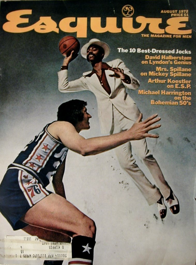 I picked up an old copy of Esquire at a used bookstore in Chelsea today. I might have passed it by had it not been for the coverline: "Mrs. Spillane on Mickey Spillane." For $5 (A bit more than the cover price in 1972: $1 -- or 2006: $3.50; but still fair.) I got the August 1972 issue -- A Mr. R. Kopper of 117 West 13th Street's issue, to be precise.
  Esquire's covers aren't as smart as they used to be, but some are well-done. September 2006 is forgettable. Esquire's website has a cover gallery showing every cover they ever did. There are some incredible ones, like February 1968's Roy Cohn cover (one of two; he also appeared ten years later.) which showed Senator Joe McCarthy's notoriously mean and notoriously gay henchman with a halo. Close up, without coverlines. It's a powerful image.
  Nixon is on twice, too. in May 1968 he appeared close up with eyes closed, in profile as four hands applied make-up. Again, a cover with no coverlines. Magazines these days can't help but to clutter covers with words to sell the contents. These older Esquire covers, the good ones at least, sold magazines with bold covers. Did they sell? Maybe it's been proven that coverlines sell issues. After all, I bought my 1972 issue because I saw Mickey Spillane's name (I'll get to him shortly).
 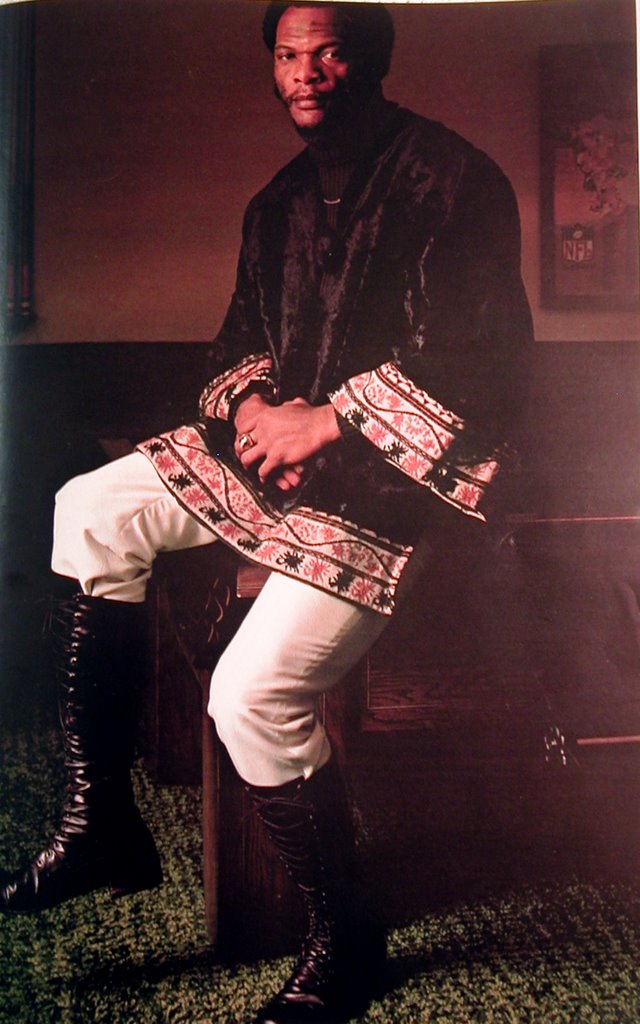 A few things about the old Esquire remains the same. In my September 2006 issue, we have a "Best Dressed List" that includes five regular chaps who won the magazine's "Best Dressed Real Men in America" contest and a celebrity list that includes Nick Cave, Jake Gyllenhaal, Terrence Howard, John Legend, Daniel Craig (the new James Bond).
 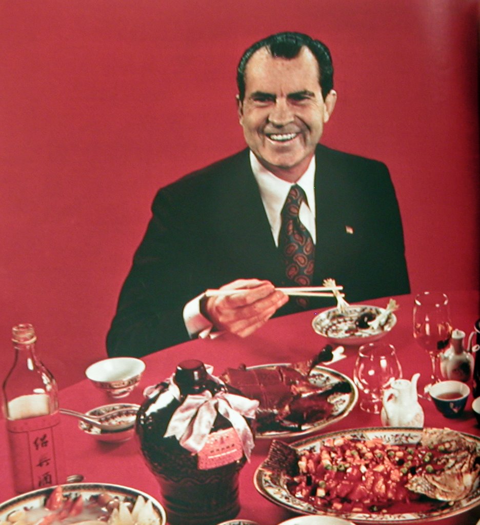 One of the stranger things in the August 1972 issue is an article called "How to Get a Great Chinese Meal in an American Chinese Restaurant" by Roy Andries de Groot. De Groot was an interesting character -- he was a blind food critic and culinary writer who lived in New York and shot himself in 1983. As a critic, he was very influential. His article in Esquire is just what the title says it is, and it's good. It's the accompanying photo of a grinning Dick Nixon amid myriad Chinese dishes that's strange. Of course, Nixon had, quite famously, just been in China in February of that year. But it remains a peculiar photo, perhaps because Nixon always looked peculiar, always looked uncomfortable and out of place. The caption for this two-page spread (of which I show only one) says:
"Each of these Chinese banquet dishes was served to President Nixon at one time or another during his trip to the mainland in February. Together, the comprise an ideal Chinese feast. You can taste them yourself in New York, San Francisco, or St. Louis by ordering the dinner in advance from one of the four great Chinese restaurants mentioned in the article."I haven't checked yet to see if any of those restaurants still exist.
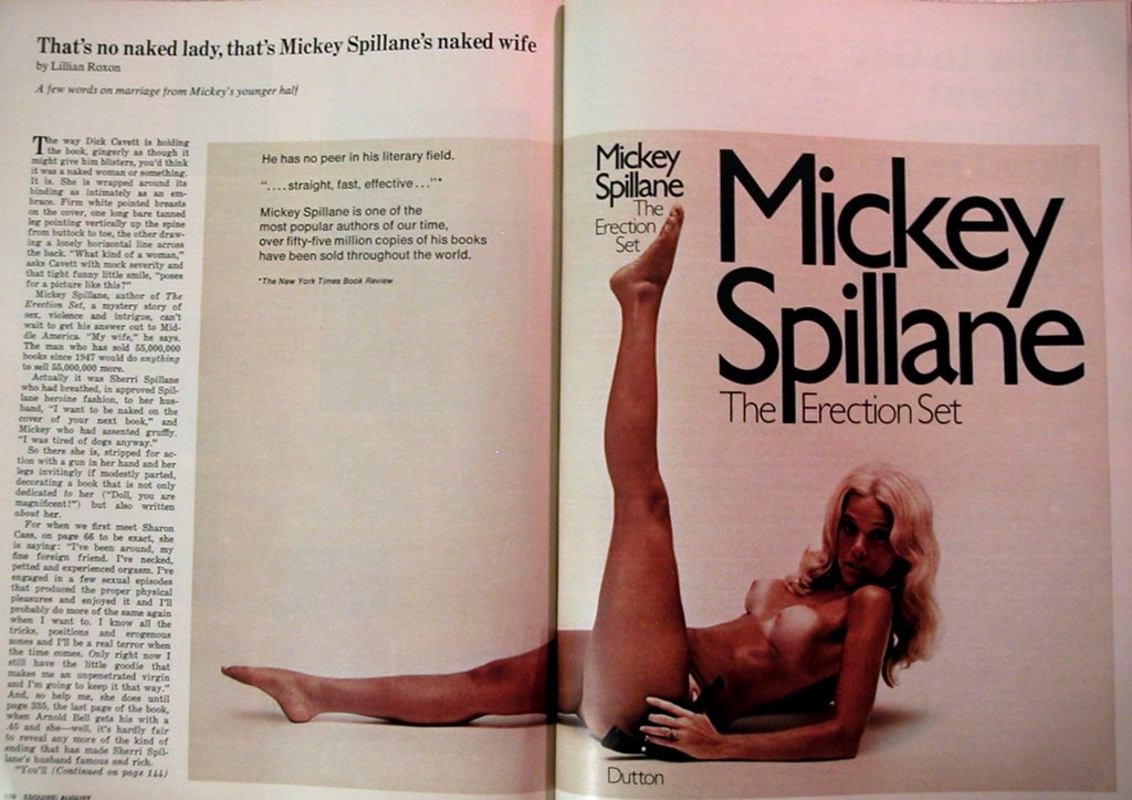 Says the article:
"Actually it was Sherri Spillane who had breathed, in approved Spillane heroine fashion, to her husband, "I want to be naked on the cover of your next book," and Mickey who had assented gruffly. "I was tired of dogs anyway."Apparently Spillane wrote her into the plot of "The Erection Set" as a sexually confident young character named Sharon. The profile is spare -- there isn't much to Mrs. Spillane, or her marriage for that matter. And that's why we have such a large, nude, photo.
posted by The Masticator at 9/16/2006 09:58:00 PM
0 comments
![]()
![]()
 It reminds me of Denmark's Ventsre Parti, their version of compassionate conservatism. "Venstre" means left, a funny name for a right-wing party, but it comes from the party's place in parliament -- they traditionally sat on the left side of the aisle. Or so I heard.
posted by The Masticator at 9/16/2006 01:26:00 PM
0 comments
![]()
![]()
 I love Vanity Fair, but every time I get my issue in the mail (and it's always a good two damned weeks after it hits the newsstand), I have a ritual. I tear every card, perfume/cologne insert, thick-papered ad, and special section out. Anything that my thumb stops on when I rifle through the magazine is destroyed. I wonder how many others have this ritual with the thick-and-glossies. My tearing usually relieves the issue of at least a quarter-inch of the thickness.
  The last time I mentioned Vanity Fair in this blog I called attention to a Hitchens piece on fellatio. This time is no less bawdy. It's a diagrammed guide to exposing one's self whilst getting out of a luxury vehicle -- just for celebrities, females take note. For those of us who search the sordid side of the celebrity coverage on the Internet, this is well-timed. Go ahead, Google "celebrity up-skirt". It'll only ask you if you meant "celebrity upskirt". Ahh, Paris.
posted by The Masticator at 9/15/2006 01:47:00 AM
0 comments
![]()
![]()
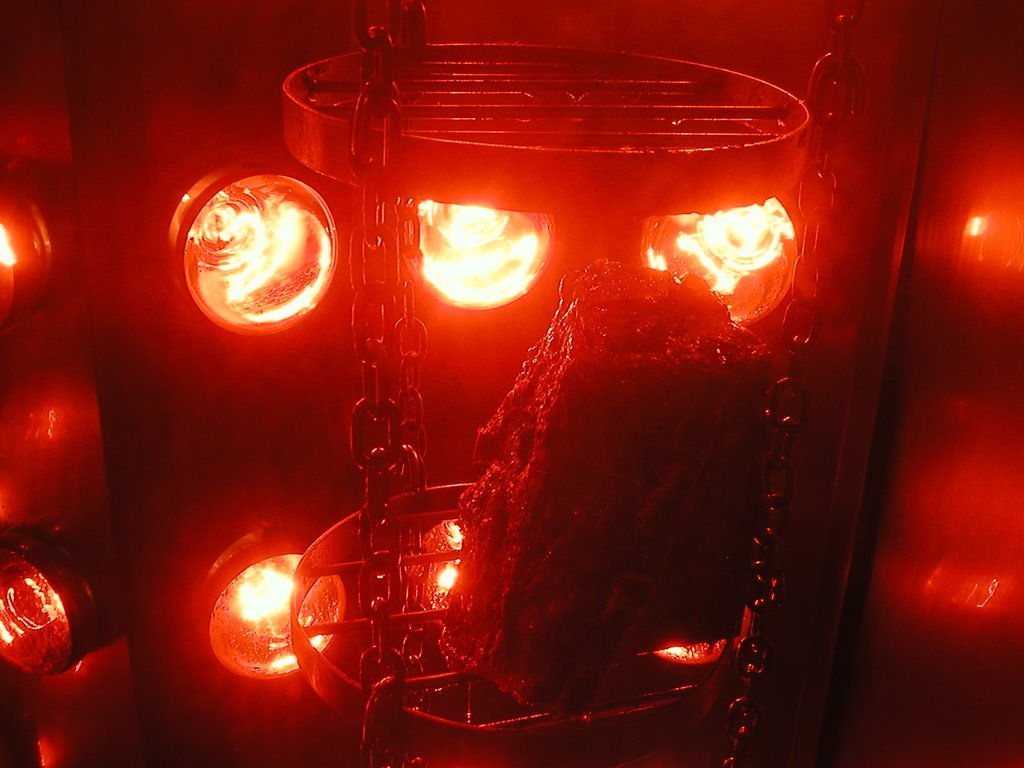 I'm back from Seattle now but here's a little hot meat from the left coast to remind us all ... I guess it's just hot meat.
posted by The Masticator at 9/15/2006 01:43:00 AM
0 comments
![]()
![]()
"Now that I'm an editor, I have an even clearer perspective. First off, while some reporters produce perfect copy that barely needs editing, you should see some of the drafts from other reporters. I won't name any names, but let's just say that some of our most enterprising and dogged reporters aren't necessarily as talented in the writing department, while some of our most skillful stylists aren't always the most energetic reporters. Not everyone can do it all, especially since the reporting and editing process is demanding work under intense deadlines. (Plus, the workload is only getting more challenging, with reporters expected to contribute to our web site.)"But his lenghty answer also included some odd editing. In the next paragraph he says "While most of the best ideas come from reporter ... " SHouldn't that says the reporter, or reporters?
posted by The Masticator at 9/14/2006 01:50:00 PM
0 comments
![]()
![]()
 As I mentioned in previous posts, I'm in Seattle for a few days on business. I've been walking all over the city looking at stuff, including some interesting buildings. I have some unkind words for Microsoft founder Paul Allen's Experience Music Project, a strange lump of a museum designed by Frank Gehry -- just scroll down. But I was impressed with Dutch architect Rem Koolhaas's Seattle Central Library. It's everything Gehry's EMP isn't.
 "Koolhaas, despite his professed admiration for Gehry, is uncomfortable with buildings that, like the Guggenheim Bilbao, seduce by dazzling. He wants to arrive at beauty as a byproduct, not the goal, of the design process. He is suspicious of the wow factor. "I like to do things that on first sight have a degree of simplicity but show their complexity in the way they are used or at second glance," he says. Although he is not a pop-culture celebrity on the order of Gehry, within his profession Koolhaas is the more influential figure -- because he writes as provocatively as he designs and because his innovative style, unlike Gehry's metallic whorls, has not solidified into a one-of-a-kind signature. "We are flamboyant conceptually, but not formally," Koolhaas says. His firm is known for thoroughly researching and radically addressing a client's needs; this cerebral approach to design undergirds all of his work."
 Where Gehry is abstract and instinctual, Koolhaas's architecture is the result of theories made practical. Nothing in a Koolhaas building is accidental or capricious, even when the shapes are as playful as they are in the Seattle Library.
 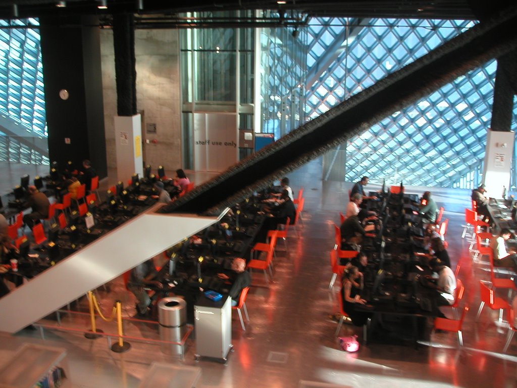 Where Gehry's EMP building had unfinished ceilings, Koolhaas is self-conscious about what's finished and what isn't. In one part of the building, angled support beams are covered in sheetrock and neatly painted up to a certain height. The rest of the beam is exposed to its fire-proof insulation.


posted by The Masticator at 9/13/2006 12:51:00 PM
0 comments
![]()
![]()

 My brother sent me a couple of peculiar photos from a recent driving trip he took through the Midwest. Here a couple of gems. If you can't read the sign in front of the boarded-up cottage, it says "Birthplace of Republican Party."
posted by The Masticator at 9/13/2006 12:04:00 PM
0 comments
![]()
![]()
 Seattle artist Michael Magrath's sculptures are made of salt. The life-size figures are modelled after Associated Press photos of suffering Iraqis, and they're intended to dissolve with the rain. I read about the sculpture set, called "Lot's Tribe," in Monday morning's Seattle Post-Intelligencer.
  The sculpture pictured above is one of three. The other two are a boy squatting and a man holding his dead son. As art, they are beautiful pieces. The detailing is inhibited by the grainy quality of the salt in a way that makes the figures look wind-blasted and rugged. Almost like Pompeii's frozen figures. The rough material enhances the figures' beleaguered expressions.
 "Lot's wife turned around to see something, and the sight froze her ... These people are in the midst of something that is changing their lives, but images from the war tend to wash over us. We see so many that we don't really see them anymore. In three dimensions, they last a little longer, but they won't last long."But what does it mean to have a set of sculptures unveiled in time for the fifth anniversary of the September 11 attacks, depicting Iraqi (and probably Muslim) war casualties, titled after a Christian bible story?
 Doesn't it conflate too many things? Iraq and Al Qaeda, 9/11 and the Iraq War, Christian and Muslim?
 Labels: art
posted by The Masticator at 9/12/2006 12:06:00 PM
1 comments
![]()
![]()
 Behold the birthplace of the United Parcel Service. Legend has it, Robert Johnson Parcel was cogitating on the top of falls here in downtown Seattle back in 1977. Mr. Parcel plummeted ten feet over the falls and when he arose from the frothy rapids, he had an idea: package deliverers whould wear brown uniforms.
  And so UPS was born, right here in downtown Seattle.
posted by The Masticator at 9/11/2006 11:50:00 AM
0 comments
![]()
![]()
"No one bats an eyelid at all the product placement in films or the sponsorship of (shows) on TV, so why should commercial novels be any different?"And
"Literary snobs might say otherwise, but all of the major literary prizes are sponsored by corporate money, so they don't mind taking the corporate (money) when it suits. I'd advise any writer to give it a go if the opportunity arises."That was Carole Matthews, author of The Sweetest Taboo, a chicklit novel that features the Ford Fiesta. Ford paid her "an undisclosed fee" to write the Fiesta into the plot.
posted by The Masticator at 9/11/2006 11:27:00 AM
0 comments
![]()
![]()

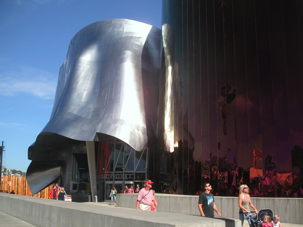 One of the reasons I'm not a fan of Gehry's work is not that he's a one trick pony (although he is); it's that I don't like that one trick. Some architects have signature styles, motifs or forms that always pop up in their work. For Santiago Calatrava the forms are arcs and fans inspired by his engineering background. I like that trick. Gehry's forms are crumpled tin foil. I don't like that one.
  On the positive side again, it's challenging to walk around the building and try to wrap your mind around its shape. Even harder to snap a representative photo of it. The most inviting side, and the one facing the Space Needle (which is about 500 feet away), is the entrance to the Science Fiction Museum. That's too bad. I think it takes away from the rock and roll part to have the grandest entrance for the least known tenant.
posted by The Masticator at 9/10/2006 10:20:00 PM
0 comments
![]()
![]()
 I'm in Seattle for a few days on business. I've never been here before, but I have some roots here -- my great grandparents on one side settled in the Seattle-Tacoma area from Norway in the early twentieth century. Walking this city, I'm struck by how much it resembles Oslo -- both are built up in hills overlooking fjords (or fjord-like bodies of water). Both are very green.
  There's a "landmark" Starbucks store in Pike's Market here in Seattle, the legendary first store. I visited the store, but I didn't buy anything. In a world with endless coffee possibilities, I can afford to be an elitist and say that I don't like their coffee.
posted by The Masticator at 9/10/2006 11:47:00 AM
0 comments
![]()
![]()


|
Provided
by ASP Batons |